Page Creator Objects Menu
Objects
Click on the Objects icon in the Page Creator to provide a drop down list of items that correspond to the objects that are currently placed in the design layout. If there are no components in the design layout, the Objects icon is grayed out.
If components have been added to the design layout, click on the Objects icon to view a menu composed of each of the components added to the layout. The menu items may include Title, Down Clues, Across Clues, Puzzle, etc. Click on one of the items in the list and a menu of options for editing that component is displayed. (Or right mouse click on any of the components in the layout to access the same menu.)
The menu options are described below. NOTE: Some options will be grayed out if they do not apply to a particular object.
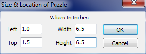
Size & Position
With this option you can be more precise (than with the mouse) in the sizing and positioning of objects. Clicking on this option will bring up a pop up window which contains four values, the position of the object from the top and left side of the paper and the height and width of the object. Each or all of these values may be changed. Depending on the paper type selected, the values will either be in inches or centimeters.
Left - Position the object a specified distance from the left edge of the paper. If the value in this field is 2, and we’re using inches, the left edge of the object will be placed 2 inches from the left edge of the paper.
Top - Position the object a specified distance from the top edge of the paper. If the value in this field is 2, and we’re using inches, the top edge of the object will be placed 2 inches below the top edge of the paper.
Width - Specify the width of the object.
Height - Specify the height of the object.
Border
Place and size borders around all components except the puzzle itself.
.png)
Use Border - Select this option to place a border around the component. In the example above, it would place a border around the Across Clues.
Width - If the Use Border option is selected, enter a value to adjust the width of the border. The value is in pixels.
Border Color - If the Use Border option is selected, click on the Change Color box to select another color to outline the component.
Fill
If any circles or rectangles have been placed in the layout, this option allows you to select a color to fill the shape.
.png)
Fill In Shape - Selecting this option fills the shape with a color that you select.
Fill Color - Click on the Change Color box to select a color to fill the shape.
Order
Bring to Front
This option brings a component that was in the background to the forefront so that it is on top of other objects.
Send to Back
This option sends a component that was on top of other objects to the background.
Change Text
Selecting the Change Text option will allow you to edit the text in certain layout components. A pop up window will appear with your current text inside the box, where you can edit the text and make any changes. After making the changes, click on the OK button to save changes or click Cancel to exit.
.png)
The only components editable with this option are the Down Header, Across Header, and the free form text area. The Down and Across Headers are primarily changed for non-English language support. The Down and Across headers may be permanently changed in the Preference settings, so that all new layouts will default to the new text.
Text Alignment
Selecting Text Alignment provides a choice to align the text to the left, center or right. Select the option preferred and the text is realigned. The components that may be aligned are Title, Down Header, Across Header, Bonus Question and the freeform text area.
Text Font
Selecting Text Font opens a standard Windows dialog allowing you to select the font type, style, size, color and effects. The components that allow this option are Title, Down Header, Across Header, Across Clues, Down Clues, Word List, Bonus Question and the freeform text area.
Answer Key Font
Using the Answer Key Font option will allow you to change the font type, style, size, color and effects for the hints placed in the puzzle or the entire answer key.
Clue Number Font
Use this option to modify the down and across numbers of the puzzle.
.png)
Change Font - Click on the Change Font button to open a standard Windows dialog that allows you to select the font type, style, size, color and effects.
Orientation - The orientation area allows you to select whether to position the clue numbers horizontally or vertically.
Load Image
Click on this option to load a bitmap, .jpg or .png image into the Image component of the layout. This action opens the Load Image File window where you can locate the correct image to load.
Delete
This option deletes the layout component highlighted and removes it from the layout.
Properties for Text Objects
The properties for text objects include the following two options, Transparent Background and Make It Fit. The Across Clues, Down Clues, Combined Clues and Word List objects also allow you to specify the number of columns to use. 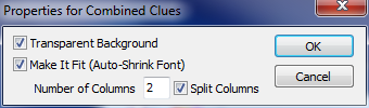
Transparent Background
The Transparent Background option makes the background of the object transparent and any color you may have assigned to the background will not appear. This option is useful for laying text on top of an image.
Make It Fit
The Make It Fit option auto sizes the font so that all the text will fit into the box size you selected. NOTE: The make it fit option will only shrink the font to make it fit, but not enlarge it. If you want the tightest fit, select a large font size and use the make it fit option.
Number of Columns
Determine the number of columns for the Across Clues, Down Clues, Combined Clues and also for the Word List.
Split Columns
This option is only available with the Combined Clues component. Select Split Columns to have the Across and Down clues displayed in separate columns. Otherwise the Across and Down clues will display consecutively, overlapping in the same column.
Properties for Puzzle Component
The Properties for Puzzle dialog provides options for editing various visual aspects of the puzzle component. These are described below. 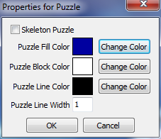
Skeleton Puzzle - Create a skeleton puzzle. Only the blocks with letters will appear, not the unused fill boxes. This is ideal for laying over the top of graphic images or to save ink if printing many copies.
Puzzle Fill Color - Click on the Change Color box to select a fill color for the puzzle. This option is not available with a skeleton puzzle.
Puzzle Block Color - If you want the blocks that contain the letters to be a color other than white, click on the Change Color button and select a new color.
Puzzle Line Color - Click on the Change Color box to select another color to outline the lettered squares.
Puzzle Line Width - To widen the lines around the boxes, increase the value from one to create a thicker line.
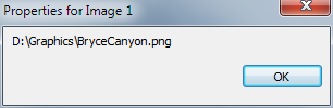
Properties for Image
The Properties for Image dialog displays the location of the image file saved to the page layout. To change the location click on the Load Image menu option to select a new image.